Saturday, 27 April 2013
New textures
Following the meeting me, Marty and Matt had on Friday, I have made some new textures for the yearbook. Rather than just using a colour filter over the whole images, I have tried just incorporating the colour schemes into the images provided. I have passed them on to Marty to add to the layout.


Thursday, 25 April 2013
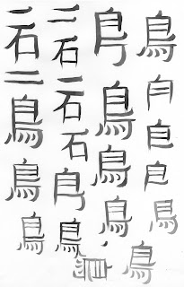
Chinese calligraphy
I have decided to have a go at some calligraphy to add to my illustrations. I have borrowed a traditional Chinese calligraphy set from a friend.
Saturday, 20 April 2013
Image developement
We have met with the girls and discussed the images on the yearbook. None of us are entirely happy with these so we have tried some variations. However, we're not sure about using a filter over the whole image as it loses quality.
We asked the girls for some more images as the ones we currently have don't give us a lot to work with. They got straight back to us with loads of great photographs. Instead of using a colour filter, I had the idea of just enhancing sections of the image so that it corresponds more with the existing colour scheme. Here are the ones we've decided to work with.
Friday, 19 April 2013
Layout
We have edited the layout further and handed this over to the girls, they have come back with some notes and asked for some changes.
Thursday, 18 April 2013
Gift card development
I have decided to revisit my greetings brief, as I was not very happy with the designs I originally produced. I have added more detail and colour to them and am much happier.
I have also ordered some envelope samples from world of envelopes to start considering how I am going to extend this brief and create a range. Originally I was thinking of having metallics running across the range, but now I think that it would be more suited to the designs to digitally print on to textured/recycled stock and use similar stock for the envelopes.
I have also ordered some envelope samples from world of envelopes to start considering how I am going to extend this brief and create a range. Originally I was thinking of having metallics running across the range, but now I think that it would be more suited to the designs to digitally print on to textured/recycled stock and use similar stock for the envelopes.
Business cards
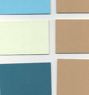
I have mocked up some business cards for India using various colour and stock variations. It was a bit of a struggle to print colour and emboss, as the wrong parts of the plate were getting inked up. I found a way around this using stencils of acetate, although this was quite fiddly. Instead I tried blind embossing, which I think came out really great, although India prefers the colour.
Colour/stock combinations:
Final mock ups:
These are India's favourite combinations,
These are India's favourite combinations,
Subscribe to:
Comments (Atom)


