Wednesday, 27 March 2013

Business Cards

Me and India are both really happy with the final logo designs, so I have gone ahead with the business cards. India has specified that she wants duplex stock, using perhaps a brown or teal with a turquoise.

The idea is to foil block or emboss both the logo on the front and the white lettering on the back. I will either make a copper plate to do this myself or depending on the cost and Indias budget, get them printed professionally. 

I have also created some other colour variations to give India a selection to choose from.


Monday, 25 March 2013

Yearbook meeting and progress

We have had another yearbook meeting to discuss our progress so far. Things to discuss:


We have put together some alternative layouts including images of the students work and the given colour combinations, we took these printouts to the meeting, but they requested we add texture to the overall design, we think that perhaps adding some to the solid blocks of colour might work best.


Thursday, 21 March 2013

Towards Creative Activism

Creative Review produced a special issue, devoted to sustainability. They printed the edition with no cover and sent it out in a biodegradable plastic bag, saving 8700 sheets of paper. As the article states 'many every day items can now be found in a luxury shade of green', meaning that we no longer have to sacrifice quality in order to follow a green philosophy.


Design Context Presentation

Grit logo

We discussed with the girls designing a logo for the front. We knew we wanted it to look 'gritty' and textured, so we decided to make a stamp. We laser cut a stamp from wood, and then scanned in the result. We are very pleased with the result.

Monday, 18 March 2013

Ecofont

I have come across a font called Ecofont. The original is based on Vera Sans, but instead on further inspection has holes throughout the type. This saves up to 50% of ink originally used so is cheaper and friendlier for the environment. Ecofont Vera Sans is free to download, but the software containing more fonts is available to download for a price.


Friday, 15 March 2013

Build & Generation Press

Today I rang Build in an attempt to organise a studio visit, I have already sent them some work before Christmas so I hoped that they would remember. Unfortunately they do not have time for me to come down, but are more than happy to answer any questions I have for my case study in an email.

They are an ideal case study for me, as they work a lot with Generation Press producing bespoke, sustainable print.


I went down for a studio visit at Generation Press last October which was an amazing day. I was greeted by Anand, who gave me a tour around the studio and print house. I was shown through various processes by the printers themselves, such as offset litho, foil stamping, embossing and letterpress. I even had a chance to pick their brains, and they kindly answered a questionnaire for my dissertation. They were also kind enough to give me many samples of print, including one of their mail-out tubes (designed by Build) full of posters, a copy of Pulp Paper and a mail-out containing various prints and postcards designed to celebrate their 10th anniversary.


Design Context

I have been working on some ideas for my design context brief. I have decided to base it on traditional and commercial printing processes and what place they have in commercial design today, also the exploration of how they can be executed sustainably.

As for the product, my initial idea is to produce a series of prints or swatch book illustrating the different processes and a publication accompanying it acting as an index, going into print processes in more depth. There are some processes that I am not going to be able to produce one offs for, such as litho and die cutting, but the list of techniques that the swatch book will include are as follows: Screenprint, emboss, lasercut, foil block, digital print and letterpress.  

I have also decided to back up this research by case studies of various printers and design studios. I am going to kick off my research by contacting Generation Press, Build, Dots Printhaus, the college print team at Vernon street and Factory 4.

Thursday, 14 March 2013

Initial layout

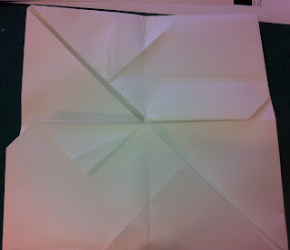
We have started laying out the printed design. This is quite difficult as we have been working with triangles. We began by experimenting with different folds, trying to keep them to a minimum to keep costs down.


Now that we know the dimensions of the design, Niall has put together an initial layout on InDesign.


Wednesday, 13 March 2013

Yearbook meeting

We had a meeting with Fred, the yearbook committee and one of the tutors on interdisciplinary. We discussed the requirements of the brief and the main point is that we need to keep it cheap, but we haven't discussed a solid budget as of yet. How it will work is that we will propose our design to the printers along with the other courses and they will then let us know if we can afford what we are asking.

The girls, Zara and Rosie from the yearbook committee were brilliant and have a solid idea of what we want. They have also provided all content for the PDF and print out.


Printed design concept:


PDF info and requirements:


Tuesday, 12 March 2013

Colour variations

I have been experimenting with different colour schemes and alterations to my illustrations for my zodiac gift cards. I am really struggling with what to do with them, I like the illustrations themselves, but incorporating them into a design is what I am finding difficult.


I think that these designs would look good screenprinted white onto a coloured stock, but I think the quality would be lost by digitally printing them, which is what I intend to do. 

Sunday, 10 March 2013

Thomas.Matthews

In 2010 design studio Thomas.Matthews unveiled a new brand identity, using solely leftover and scrap materials. Instead of letting the design inform production the design has been driven by material concerns and what production methods are most eco friendly, and they have had interesting results.

They used leftover prints from an over run at their printers, Calverts. They then used leftover vegetable based spot inks, and even checked that they wouldn't be harmful towards the environment.

I think that this is a great concept and goes to show that following a sustainable ethos doesn't have to be at the expense of quality design.


http://www.creativereview.co.uk/cr-blog/2010/february/thomas-matthews-identity

http://www.calverts.coop/

http://thomasmatthews.com/


Saturday, 9 March 2013

Colours and Patterns

I have been experimenting with some colour and pattern combinations using the work and swatches provided by India. These are to be applied to the look book/poster design and promotional pack.