Wednesday, 30 January 2013
Tuesday, 29 January 2013
Woodblock
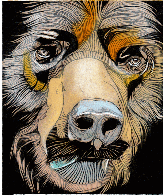
I have scanned in some of India's original carved woodblocks. I love these designs, and I think that it would work really well to incorporate the wooden textures and grains in her branding, as she uses woodblock throughout a lot of her work. She also uses quite an earthy, natural colour palette.
India's work
Today I met with Inda to go through her work so that I could get more of a feel of her style, and consider how I am going to incorporate her designs into the actual designs of her branding and packaging. The photos that I have initially taken are not great quality as they are just for research purposes. I have asked India to select some pieces that she wants to feature in her final publication, so that I can photograph them to a high standard.
I have photographed illustrations and elements of patterns that I think could be developed and incorporated into my designs.
I have photographed illustrations and elements of patterns that I think could be developed and incorporated into my designs.
Monday, 28 January 2013
Sunday, 27 January 2013
Saturday, 26 January 2013
Thursday, 24 January 2013
Branding and promotion
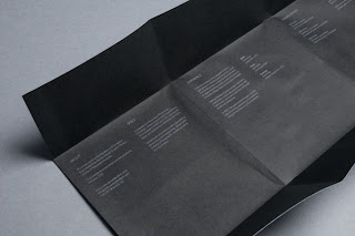
I have found some self promotion by a graphic designer, Joshua Middleditch. Although his overall branding isn't what I am thinking of for Indias branding, his publication caught my eye. He has used a fold out design. It may be an effective way to produce a number of small publications, that saves on time and money, cutting out the binding aspect.


Saturday, 19 January 2013
Logo generation
I have been working on the logo for the Leeds Stonegate loyalty card. I began by sketching it out by hand, and then editing on Illustrator. I have experimented with various different weights, spacing and then finally with colours schemes.
Here is the final image that have sent for approval.
My collaborator, Kerry really liked the designs, and she is now going to add the buildings in the backdrop and reply for my approval.
Illustrative type
I have been looking at various illustrative type to influence my design for the Leeds Stonegate loyalty card. I am going for a handwritten approach, quite sophisticated looking with joined and pehaps italicised lettering.
Deanne Cheuk. I like this take on type, disregarding the busy pattern surrounding it, the lettering itself is really beautiful. Even though entirely uppercase is used, it is still easy to read and elegant looking. This style would work well with the word privilege. Considering the design I am producing only requires one word, I don't think that the use of capital letters will effect the readability.
http://redriotclothing.wordpress.com/2012/01/12/deanne-cheuk/

Seb Lester is a favourite of mine. Although his finished, more complex type is absolutely stunning, I adore his sketches and initial lettering. This style is perhaps a bit too elaborate for my brief, but their are definitely elements that I can incorporate into my design.
Si Scott is another obvious pro at illustrative type, but again I think this style may be too elaborate for the design of the loyalty card. However I do like the idea of taking a simple, block typeface and the adding the elegant detail after, something definitely worth considering for my own design.
Kate Forrester's work is less elaborate than other designers that I have looked at, which is more appropriate to the brief I am working on. I love her logos, which are simple with added details to give them a more elegant look.
I love the lettering on the packaging for these wine bottles. They are WETZER wines, handcrafted wine from Hungary, lettering designed by László Mihály Naske.
Subscribe to:
Comments (Atom)


